使用python中的matplotlib进行绘图分析数据
最近老板让我们画图,然后网上的教程实在是有点简单。很多高标准的操作都没有方法,于是自己写一篇教程。
pylab(使用工具)
pylab將許多常用的module集中到統一的namespace,目標是提供一個類matlab的工作環境,使用者無需自行import所需功能。不過import explicitly是編程的好習慣,讓命名空間乾淨些,如無必要應避免使用pylab。(pyplot是matplotlib的繪圖界面)
其实也就是 matplotlib.pyplot
画图
引入库,设置画布大小
1
2
from pylab import *
plt.figure(figsize=(10, 7))如果不用pylab包的话,我们需要单独引入如下三个包
1
2
3
import numpy as np
import matplotlib.pyplot as plt
import matplotlib效果是一样的
读取数据
这里我写了一个简单的文件读取函数,用到numpy来自动分割1
2
3
4
5
6
7
8
9
10
11
12
13#读取文件部分
def readfile(filename):
filename = 'data\\' + filename
content = np.loadtxt(filename)
return content
a = readfile('1.txt')
b = readfile('2.txt')
c = readfile('3.txt')
d = readfile('4')
influence = [x[4] for x in a]
influence1 = [x[4] for x in b]
influence2 = [x[4] for x in c]
influence3 = [x[7] for x in d]用
np.loadtxt读取数据的好处是,可以自动将数据分割。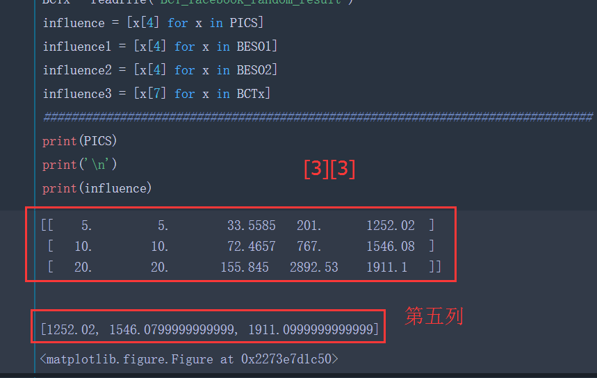
画图部分
- 设置一些宏观的东西
1
2
3
4
5
6
7
8plt.xticks(fontsize=25) # x轴坐标标签字体大小
plt.yticks(fontsize=30)# y轴坐标标签字体大小
plt.ylim(0, 4000) # y轴坐标范围
plt.yticks([0, 2000, 4000])#设置标签
plt.xlabel('(B,|Q|)', fontsize=30)
plt.ylabel('InfluenceSpread', fontsize=30)
bar_width = 0.2#柱子宽度
plt.subplots_adjust(left=0.16, right = 0.97,wspace=0.2, hspace=0.2, bottom=0.14, top=0.90)#调整图像的位置 - 塞数据
1
2
3
4
5
6
7
8
9
10
11
12
13
14x_pos = np.arange(len(a))
plt.bar(left=x_pos, height=influence3, width=bar_width, color='#ED1C24', label="x_pos", ec='white', align="center")
P_pos = np.arange(3)
P_pos = [i+bar_width for i in PICS_pos]
plt.bar(left=P_pos, height=influence, width=bar_width, color='#1F77B4', label="P", ec='white', align="center")
B_1 = [i+2*bar_width for i in x_pos]
plt.bar(left=B_pos, height=influence1, width=bar_width, color='#FF7F0E', label="B_1", ec='white', align="center")
B_2 = [i+3*bar_width for i in x_pos]
plt.bar(left=BESO2x_pos, height=influence2, width=bar_width, color='#2CA02C', label="B_2", ec='white', align="center") - 加底部横坐标标签
1
2
3BESO2x = ['(5,5)','(10,10)','(20,20)','(30,30)','(40,40)','(50,50)']
x_final_pos = [i-1.5*bar_width for i in BESO2x_pos] #调节横坐标轴的位置
plt.xticks(x_final_pos, BESO2x, )运行一下看看
到目前位置,代码这么多1
2
3
4
5
6
7
8
9
10
11
12
13
14
15
16
17
18
19
20
21
22
23
24
25
26
27
28
29
30
31
32
33
34
35
36
37
38
39
40
41
42
43
44
45
46
47from pylab import *
plt.figure(figsize=(10, 7))
########################################################################
#读取文件部分
def readfile(filename):
    filename = 'data\\' + filename
    content = np.loadtxt(filename)
    return content
a = readfile('1.txt')
b = readfile('2.txt')
c = readfile('3.txt')
d = readfile('4')
influence = [x[4] for x in a]
influence1 = [x[4] for x in b]
influence2 = [x[4] for x in c]
influence3 = [x[7] for x in d]
###############################################################################
#设置一些宏观的东西
plt.xticks(fontsize=25)
plt.yticks(fontsize=30)
plt.ylim(0, 4000)
plt.yticks([0, 2000, 4000])
plt.xlabel('(B,|Q|)', fontsize=30)
plt.ylabel('InfluenceSpread', fontsize=30)
bar_width = 0.2
plt.subplots_adjust(left=0.16, right = 0.97,wspace=0.2, hspace=0.2, bottom=0.14, top=0.90)
###############################################################################
#画图部分
x_pos = np.arange(len(a))
plt.bar(left=x_pos, height=influence3, width=bar_width, color='#ED1C24', label="x_pos", ec='white', align="center")
P_pos = np.arange(3)
P_pos = [i+bar_width for i in PICS_pos]
plt.bar(left=P_pos, height=influence, width=bar_width, color='#1F77B4', label="P", ec='white', align="center")
B_1 = [i+2*bar_width for i in x_pos]
plt.bar(left=B_pos, height=influence1, width=bar_width, color='#FF7F0E', label="B_1", ec='white', align="center")
B_2 = [i+3*bar_width for i in x_pos]
plt.bar(left=BESO2x_pos, height=influence2, width=bar_width, color='#2CA02C', label="B_2", ec='white', align="center")
###############################################################################
#数据保存+展示
plt.legend(loc='upper left', fontsize=20)
plt.show()
###############################################################################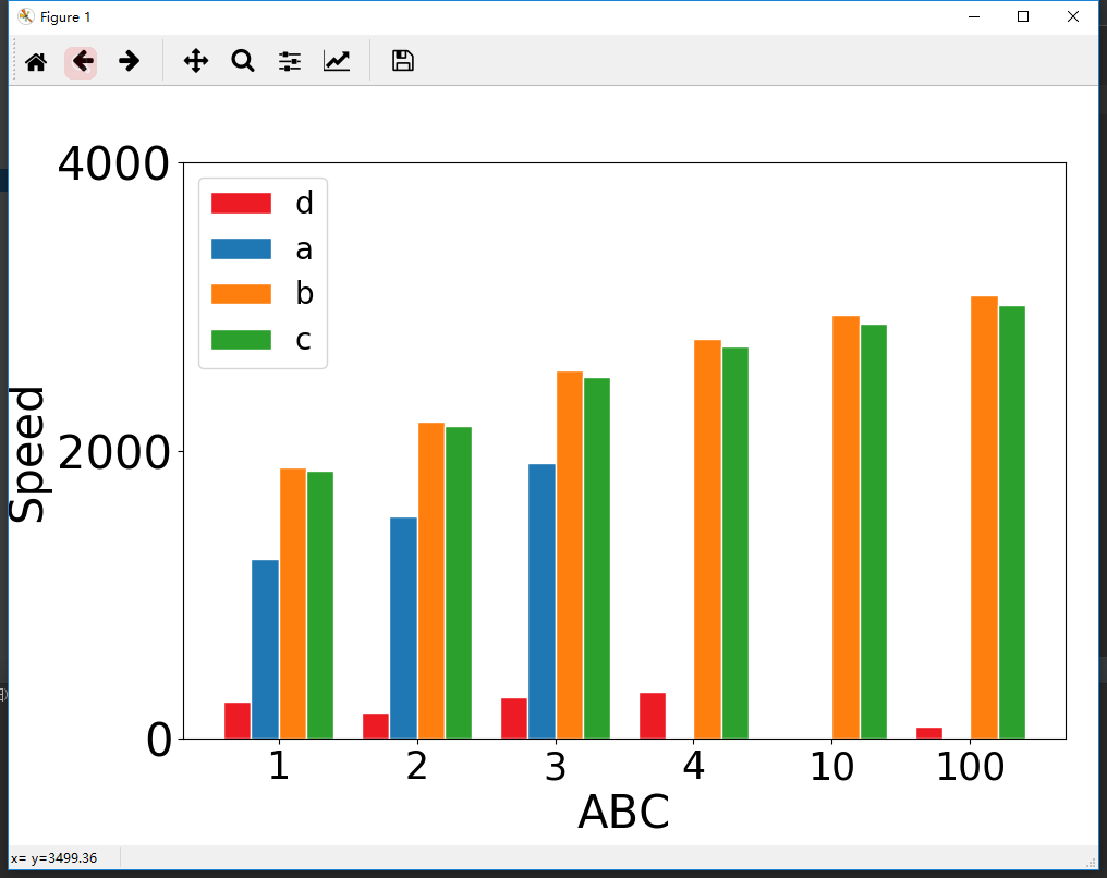
大概效果已经出来了,那么继续优化一下
优化篇
- 使用Python画图并设置科学计数法
1
2
3
4ax = plt.gca() #获取当前图像的坐标轴信息
xfmt = ScalarFormatter(useMathText=True)
xfmt.set_powerlimits((0, 0)) # Or whatever your limits are . . .
gca().yaxis.set_major_formatter(xfmt)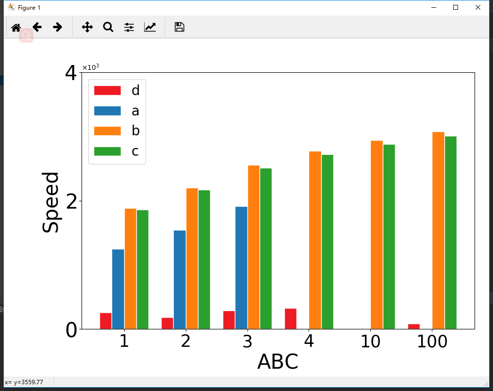
嗯,效果还可以,就是这个左上角的标志太小了。
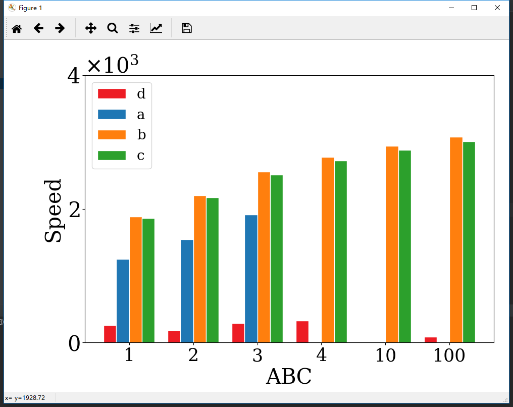
这个地方怎么调整一下,想到所有标志都有大小,所以我们只需要添加一个默认值即可。 - 左上角科学计数法标签大小设置
1
matplotlib.rcParams.update({'font.size': 30, 'font.family': 'serif'})#设置左上角标签大小
- 最后代码
1
2
3
4
5
6
7
8
9
10
11
12
13
14
15
16
17
18
19
20
21
22
23
24
25
26
27
28
29
30
31
32
33
34
35
36
37
38
39
40
41
42
43
44
45
46
47
48
49
50
51
52
53
54
55
56
57
58
59from pylab import *
plt.figure(figsize=(10, 7))
matplotlib.rcParams.update({'font.size': 30, 'font.family': 'serif'})#设置左上角标签大小
##################纵坐标设置为科学计数法#######################################
ax = plt.gca()  #获取当前图像的坐标轴信息
xfmt = ScalarFormatter(useMathText=True)
xfmt.set_powerlimits((0, 0))  # Or whatever your limits are . . .
gca().yaxis.set_major_formatter(xfmt)
########################################################################
#读取文件部分
def readfile(filename):
filename = 'E:\\123\\' + filename
content = np.loadtxt(filename)
return content
a = readfile('a.txt')
b = readfile('b.txt')
c = readfile('c.txt')
d = readfile('d')
influence = [x[4] for x in a]
influence1 = [x[4] for x in b]
influence2 = [x[4] for x in c]
influence3 = [x[7] for x in d]
###############################################################################
#设置一些宏观的东西
plt.xticks(fontsize=25)
plt.yticks(fontsize=30)
plt.ylim(0, 4000)
plt.yticks([0, 2000, 4000])
plt.xlabel('ABC', fontsize=30)
plt.ylabel('Speed', fontsize=30)
bar_width = 0.2
plt.subplots_adjust(left=0.16, right = 0.97,wspace=0.2, hspace=0.2, bottom=0.14, top=0.90)
###############################################################################
#画图部分
x_pos = np.arange(len(d))
plt.bar(left=x_pos, height=influence3, width=bar_width, color='#ED1C24', label="d", ec='white', align="center")
PICS_pos = np.arange(3)
PICS_pos = [i+bar_width for i in PICS_pos]
plt.bar(left=PICS_pos, height=influence, width=bar_width, color='#1F77B4', label="a", ec='white', align="center")
BESO1x_pos = [i+2*bar_width for i in x_pos]
plt.bar(left=BESO1x_pos, height=influence1, width=bar_width, color='#FF7F0E', label="b", ec='white', align="center")
BESO2x_pos = [i+3*bar_width for i in x_pos]
plt.bar(left=BESO2x_pos, height=influence2, width=bar_width, color='#2CA02C', label="c", ec='white', align="center")
BESO2x = ['1','2','3','4','10','100']
x_final_pos = [i-1.5*bar_width for i in BESO2x_pos]
plt.xticks(x_final_pos, BESO2x, )
###############################################################################
#数据保存+展示
plt.legend(loc='upper left', fontsize=20)
plt.show()
###############################################################################
- 左右间距觉得不合适?
在这里可以自己调节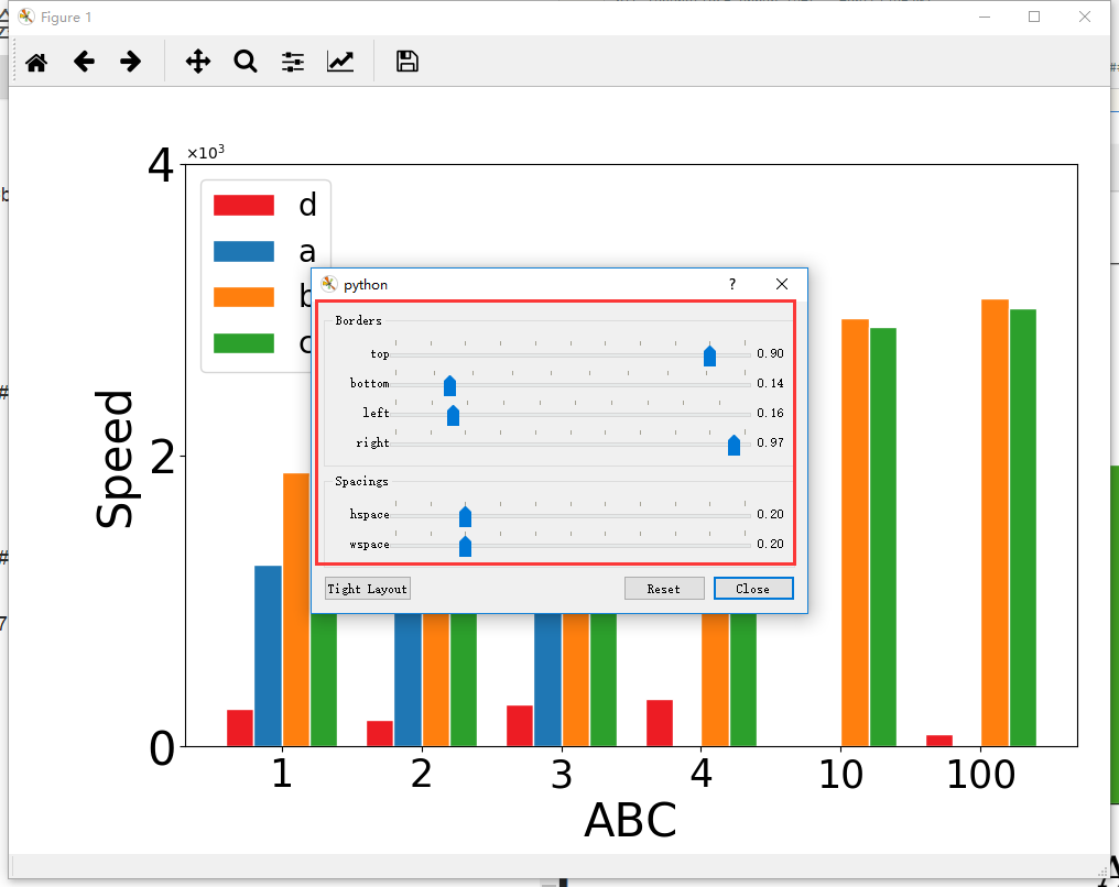
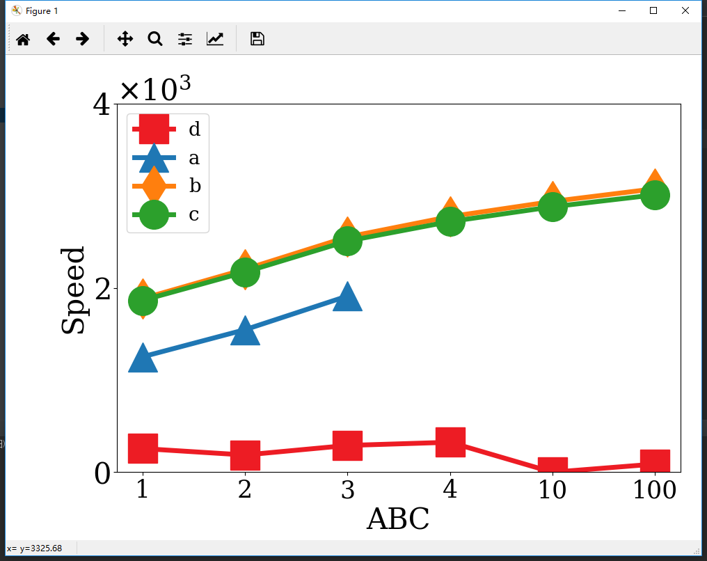
python画折线图
折线图要比柱状图容易很多1
2
3
4
5
6
7
8
9
10
11
12
13
14
15
16
17
18
19
20
21
22
23
24
25
26
27
28
29
30
31
32
33
34
35
36
37
38
39
40
41
42
43
44
45
46
47
48
49
50
51
52
53from pylab import *
plt.figure(figsize=(10, 7))
##################纵坐标设置为科学计数法#######################################
ax = plt.gca() #获取当前图像的坐标轴信息
xfmt = ScalarFormatter(useMathText=True)
xfmt.set_powerlimits((0, 0)) # Or whatever your limits are . . .
gca().yaxis.set_major_formatter(xfmt)
########################################################################
#读取文件部分
def readfile(filename):
filename = 'E:\\123\\' + filename
content = np.loadtxt(filename)
return content
a = readfile('a.txt')
b = readfile('b.txt')
c = readfile('c.txt')
d = readfile('d')
influence = [x[4] for x in a]
influence1 = [x[4] for x in b]
influence2 = [x[4] for x in c]
influence3 = [x[7] for x in d]
###############################################################################
#设置一些宏观的东西
plt.xticks(fontsize=25)
plt.yticks(fontsize=30)
plt.ylim(0, 4000)
plt.yticks([0, 2000, 4000])
plt.xlabel('ABC', fontsize=30)
plt.ylabel('Speed', fontsize=30)
bar_width = 0.2
plt.subplots_adjust(left=0.16, right = 0.97,wspace=0.2, hspace=0.2, bottom=0.14, top=0.90)
###############################################################################
#画图部分
x_pos = np.arange(len(d))
plt.plot(x_pos, influence3, color='#ED1C24', marker='s', linewidth=5, markersize=30, label="d")
pos = np.arange(3)
plt.plot(pos, influence, color='#1F77B4', marker='^', linewidth=5, markersize=30, label="a")
plt.plot(x_pos, influence1, color='#FF7F0E', marker='d', linewidth=5, markersize=30, label="b")
plt.plot(x_pos, influence2, color='#2CA02C', marker='o', linewidth=5, markersize=30, label="c")
stick = ['1','2','3','4','10','100']
plt.xticks(x_pos, stick, )
###############################################################################
#数据保存+展示
plt.legend(loc='upper left', fontsize=20)
plt.show()
###############################################################################
使用python中的matplotlib进行绘图分析数据